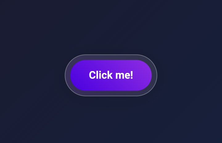
Discover Open Source Web Components

Explore our collection of reusable UI building blocks for your next project

Web Components

Gradient Button Component

Gradient Button

Gradient button with smooth color transitions

Button Gradient
Toggle Component

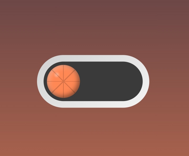
3D Basketball Toggle Switch

Switch between basketball-themed modes with this interactive 3D toggle.
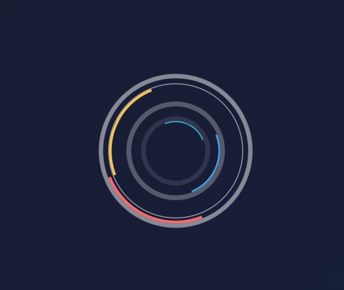
Toggle Animation Switch
Orbital Loader

Orbital Loader

Circles pulse and rotate in a continuous loop, offering a captivating loading animation.
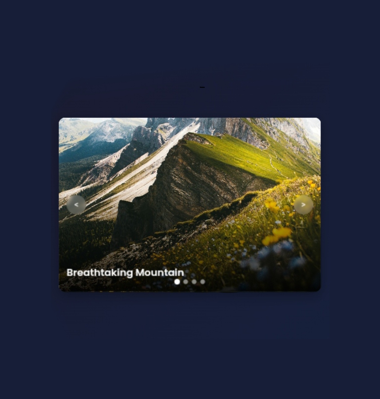
Loader AnimatedLoader Loading
Carousel Component

Carousel

A carousel with smooth transitions and fading effects. Perfect for showcasing your best content with style.
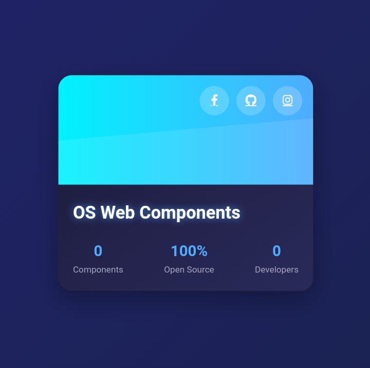
Gallery Slider Carousel
Futuristic Card

Futuristic Card

Futuristic card, the cutting-edge interface design for the next generation of digital experiences.

Card Futuristic UI
Input Form Component

Input Search Bar

Stylish search bar with gradient effects and clear, user-friendly interface

InputField SearchBar

About Our Project

Open Source Web Components is a community-driven initiative providing a comprehensive library of reusable, customizable UI elements. Our mission is to empower developers of all skill levels by offering a valuable resource for creating modern, efficient web applications.

Installation Guide

Download

Clone or download the repository from GitHub to your local machine.

01

Navigate

Open your terminal and navigate to the project directory.

02

Dependencies

Install necessary dependencies using npm or yarn.

03

Run

Start the development server and open the project in your browser.

04